No single visual language
Bold white captions, serif text boxes, a holiday script, a dense flyer and raw video frames all compete. The work feels collected rather than art-directed.
A note to Paula
Paula, you make genuinely engaging videos. You clearly have taste, style and creative instinct — and I really enjoy your work.
The inconsistency in the grid predates your work and was created by a previous specialist. This is not a critique of your content. It is an invitation to make the profile packaging match the quality of what you are already producing.
The bottom line
A thumbnail is a doorway into the reel. Today, those doorways use different visual rules, so the profile asks visitors to re-learn the brand tile by tile. A compact cover system will make the account easier to scan, more recognisable and more premium — without flattening Paula’s creativity.
01 · Current grid audit
The visible grid mixes raw project photos, talking-head frames, review screenshots, promotional artwork and seasonal graphics. Variety is useful; visual drift is not.

Bold white captions, serif text boxes, a holiday script, a dense flyer and raw video frames all compete. The work feels collected rather than art-directed.
Some covers have no message, some have several, and some use text too small to scan. A visitor cannot quickly predict what is worth opening.
A mid-sentence expression or weak crop can make a strong reel feel less intentional. Faces work best when the expression is confident and the story is obvious.
The projects already provide premium photography. Calm crops, restrained type, generous space and one recurring accent would let that quality lead.
What is already working
02 · Why consistency matters
A repeated label, crop and type hierarchy help visitors recognise Delta Decks before they even see the logo.
For a premium home project, visual discipline quietly suggests the same care will be applied to planning and construction.
Specific outcomes and questions let homeowners quickly find the project, answer or proof that matters to them.
A small set of brand anchors — not identical layouts — turns separate posts into one recognisable body of work.
03 · The proposed system
Consistency should feel like an editorial system, not a rigid checkerboard. Keep three anchors constant — type, palette and label — while the subject, crop and story change.
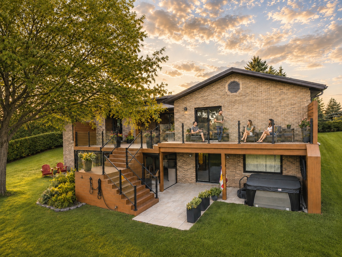 PROJECT REVEALOne backyard.Two levels.DELTA DECKS
Let the finished project carry the emotion. Add only a compact outcome-led headline.
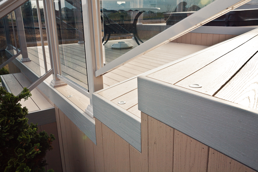 EXPERT FIXScratch on PVC?Try this first.DELTA DECKS
Lead with the homeowner problem and promise a useful answer. Keep the expert frame inside the reel.
CLIENT QUESTIONCompositeor PVC?DELTA DECKSUse the exact question, not the generic label “Answering client questions.”
PROOF / REVIEWWhy homeownersrecommend us.DELTA DECKSTurn a dense review screenshot into one proof point; put the full testimonial in the carousel or caption.
04 · Cover rules
Every rule is a constraint that protects clarity, while leaving the story and editing style free.
One cover should answer one question: why should I tap?
Use one compact hook, ideally across no more than two lines.
Choose the deck, a detail or a strong face — never all three at equal weight.
One headline weight and one label weight. No decorative font rotation.
Use lime as a signal, not a background on every post.
If the hook is not readable at grid size in two seconds, simplify it.
Faces are not the problem; accidental frames are. Use a face when the expression is confident, natural and clearly supports the topic. Otherwise choose a deliberate portrait, a product detail, or the finished deck. Never let a random mid-word frame become the brand’s first impression.
05 · Recommended first sprint
Start with the top two rows shown in the supplied snapshot. Approve one row of three first, then finish the remaining nine as a batch.
06 · Canva handoff
Adding Paula to the Canva team is the fastest way to make consistency easy rather than dependent on memory.
Lock logo, guides, type styles and label position. Leave the image, hook and optional category editable.
07 · A simple approval flow
Paula creates three covers as one row using the four-template system.
Dima approves the system — not every tiny design choice — before the full batch.
Finish 8–12 covers, preview the live crop, check spelling and publish the update.
“The goal is not to make every tile identical. The goal is to make every tile unmistakably Delta Decks.”
Research notes
Platform behaviour changes, so the crop and thumbnail controls should be confirmed in the live Delta Decks account before the batch is applied.